I think it is fun to look at historical data for our local market. I can be a bit of a statistics “dork” at times, but data doesn’t lie. It will tell you what is really going in our market. Thanks to Mike Malec, one of our local Realtors, for putting together these graphs for the Boulder Area Realtor Association. Both graphs show numbers for all of Boulder County.
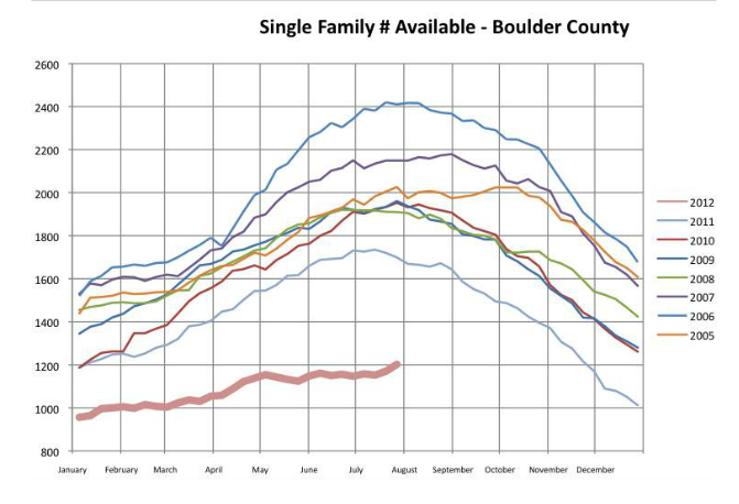
You will see that in 2012 (the lowest thick line in the first chart below) we have about half of the inventory that we had at this time in 2006 (the highest blue line in the first chart below). The number of available single family homes remains well below the average for the past 7 years. Also of note is that the total number of homes in Boulder County has grown by 2,770 homes through the end of 2011. Increasing demand and less inventory is helping prices rise. The crazy thing is we are not seeing as many Sellers as we thought we would jump into the market. Hopefully by early 2013 we’ll see some more inventory. Time will tell.
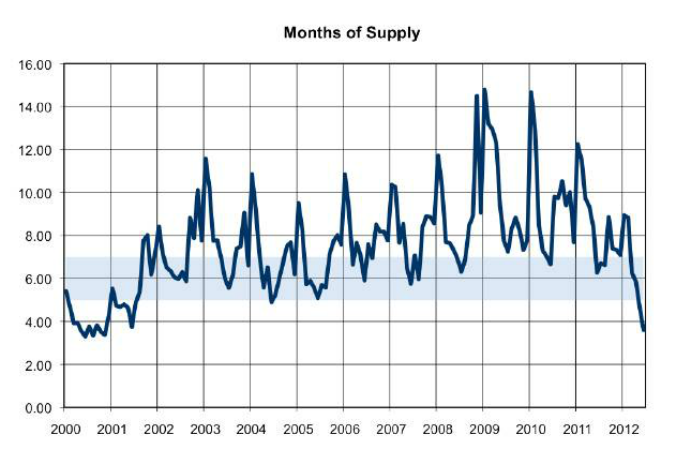
The currently available months of inventory is the lowest it has been since 2000 (see the second chart below). If you can’t seem to find a house, there is a reason why. There just are not that many to buy. I’ll follow these numbers and keep you posted!
Boulder County Inventory 2005-2012
Boulder County Month of Inventory 2000-2012

